10 Types of Sport Team Logos to Help You Dominate NHL Trivia
Master NHLdle and other hockey guessing games by learning to identify 10 key types of sport team logos. Level up your hockey trivia knowledge today!
Ever get stuck trying to guess that mystery player in NHLdle, staring at a team logo you just can't place? You're not alone. Every hockey fan knows the gut punch of a missed guess, but the key to getting that satisfying green square is often hidden in plain sight, right in the crest. It's not just about memorising who plays for the Habs or the Bolts; it's about understanding the why behind their sport team logos.
Different eras, cities, and team identities have led to specific logo styles. Once you learn to spot these patterns, like classic shields, fierce mascots, or sleek modern designs, you start seeing the game differently. This is your playbook for sharpening your hockey IQ and recognizing visual cues that connect players to franchises. Understanding the foundational principles of what makes these emblems memorable is crucial, much like creating effective t-shirt design logos that resonate with a fanbase.
We're breaking down 10 types of team logos, connecting them to NHL history, and giving you actionable tips to turn that logo clue into your biggest advantage. Get ready to boost your win streaks and celly like you just went top cheese.
1. Wordmark/Logotype Logos
Sometimes, the most powerful statement a team can make is with its own name. Wordmark logos, also known as logotypes, ditch the mascots and complex crests in favour of pure, stylized typography. This approach puts the team’s name front and centre, relying on custom lettering to forge an unforgettable identity. It’s a classic, confident choice that transforms text into an emblem of tradition and pride.
Many of the most enduring sport team logos are wordmarks. In hockey, the Toronto Maple Leafs' iconic lettering is a masterclass, while the Colorado Avalanche's angular wordmark perfectly captures their identity. The New York Rangers' diagonal text is another timeless example of letterform-based branding. These logos prove that with the right font and creative flair, letters alone can carry the weight of a franchise's history.
Actionable Insights for NHLdle Players
- Font Style Gives Clues: A classic, serif font might point to an Original Six team, while a modern, aggressive font could belong to a newer franchise.
- Unique Letters Stand Out: Notice the unique "A" in the Avs logo or the specific curve of the Rangers' letters. These details are dead giveaways.
- Wordmark-Only Teams are Rare: Teams that primarily use a wordmark are easier to remember. Think of the Rangers, Hurricanes, or Devils.
2. Mascot/Character-Based Logos
Nothing connects with a fanbase quite like a great character. Mascot logos inject personality and emotion directly into a team's brand, giving fans a figure to rally behind. These designs feature an animal, creature, or character that embodies the spirit of the team, creating a powerful and memorable visual identity. From ferocious beasts to determined human figures, this approach turns a logo into a living, breathing symbol of the team's heart and fight.
Many of the most beloved sport team logos are built around a mascot. Look at the Chicago Blackhawks' iconic profile or the Ottawa Senators' Centurion. These aren't just pictures; they're characters that fuel merchandise, on-ice mascots, and fan chants. A powerful mascot, like the Nashville Predators' saber-toothed tiger, tells a story of speed and skill. It's a strategy that builds a deep, emotional connection that lasts for generations.
Actionable Insights for NHLdle Players
- Identify the Mascot: Seems obvious, but is it a Panther, a Predator, or a Coyote? Knowing the specific animal instantly narrows your search.
- Think About Nicknames: A player who gets traded from the Panthers to the Predators is still a "Cat." This kind of trivia helps connect players across teams.
- Note the Mascot's Style: Is it fierce like the original Senators logo or more modern like the current one? This can help place the era a player was on the team.
3. Shield/Crest Logos
Drawing inspiration from classic heraldry, shield or crest logos convey a powerful sense of tradition, honour, and authority. This approach wraps the team’s identity in a symbol of unity and strength, often incorporating multiple elements like mascots, wordmarks, and historical symbols into a single, cohesive emblem. It’s a timeless choice that speaks to a club's deep-rooted heritage and unwavering pride.
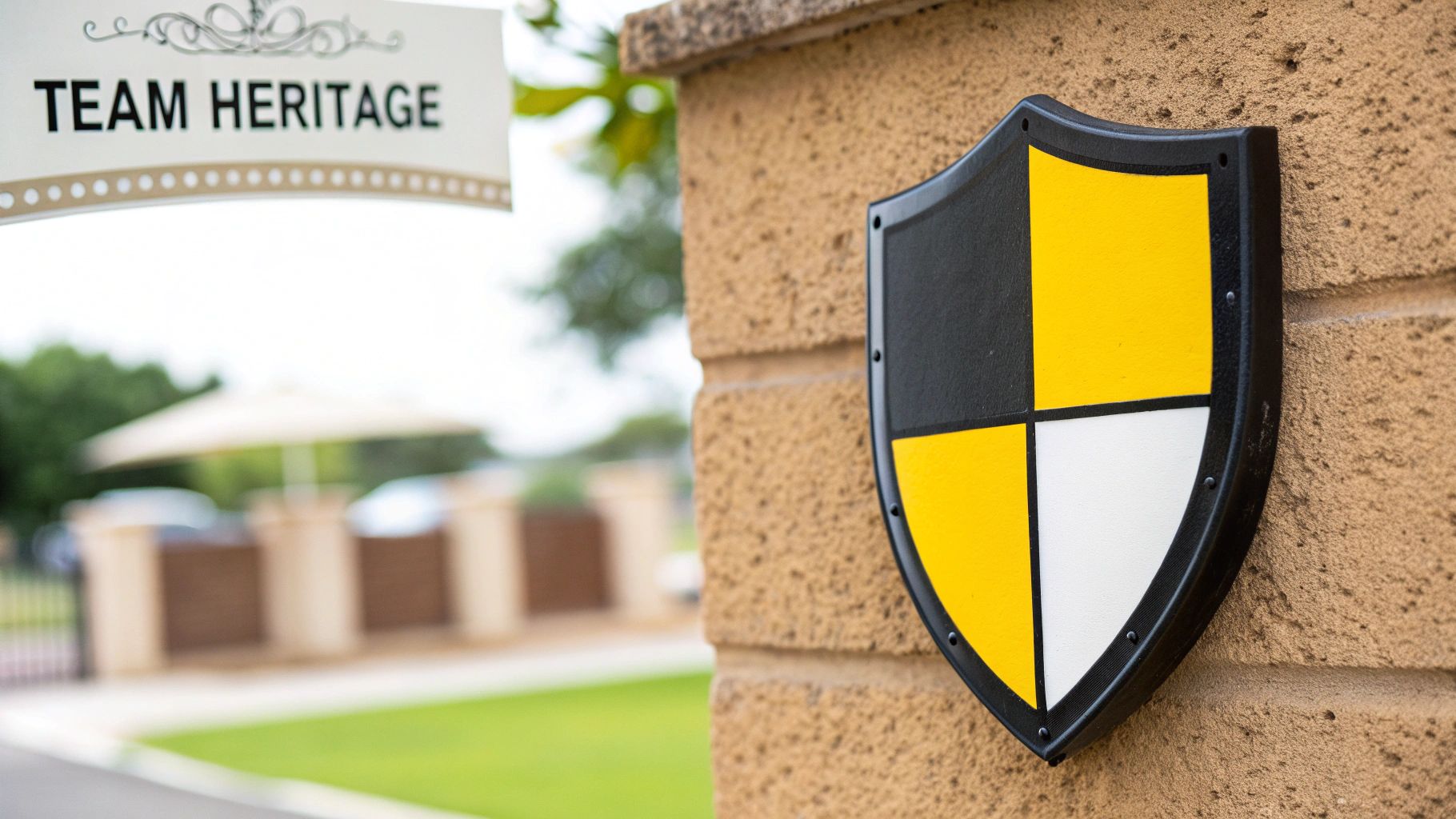
Many of the world's most storied clubs use this style to represent their legacy. The Montreal Canadiens' "C" wrapped around the "H" is arguably the most famous crest in hockey history. The Edmonton Oilers' logo, with the oil drop on a crest, feels both modern and traditional. These powerful sport team logos act as a badge of honour, connecting generations of fans under one unified symbol that tells a rich, visual story.
Actionable Insights for NHLdle Players
- Look for Hidden Details: The Habs' "H" stands for "Habitants," not just "Hockey." The St. Louis Blues' note has a wing. These details are trivia gold.
- Crests Mean History: A shield logo often signifies a team with a long history, so you might be dealing with a veteran player or someone from an older era.
- Associate Players with the Crest: Think of Mark Messier hoisting the cup in that Oilers crest or Patrick Roy guarding the net behind the Canadiens' shield.
4. Geometric/Abstract Logos
Sometimes, less is truly more. Geometric and abstract logos strip a team’s identity down to its purest form, using clean lines, simple shapes, and negative space to create a powerful, modern symbol. This approach moves away from literal depictions of mascots, favouring a sophisticated and minimalist aesthetic that is both timeless and highly scalable. It’s a bold choice that communicates confidence, precision, and a forward-thinking brand philosophy.
Many of the most celebrated sport team logos embrace geometric principles. The Philadelphia Flyers' "Flying P" is a masterclass in simple, motion-filled design. The New York Islanders logo cleverly uses geometric shapes to depict Long Island itself. The original Colorado Rockies logo (before they became the Devils) was a brilliant abstract take on the state's flag. These logos prove that a compelling identity can be forged from simplicity and smart design.
Actionable Insights for NHLdle Players
- Learn the Symbolism: The Islanders' logo points to the Nassau Coliseum's location. The Washington Capitals' eagle uses negative space to form the Capitol building. Knowing these hidden meanings is a huge advantage.
- Think Era: Abstract logos were very popular in the 70s and 80s. Seeing a logo like the Whalers' can help you zero in on players from that time, like Ron Francis.
- Connect Shapes to Nicknames: The "Flying P" for the Flyers, the "Music Note" for the Blues—these are quick mental shortcuts.
5. Interlocking Letters/Monogram Logos
Taking the essence of a wordmark and condensing it into a powerful, compact symbol, interlocking letter and monogram logos are a timeless choice. This design method combines two or more letters, typically a team's initials, into a single, unified emblem. It creates instant recognition while maintaining a clean, professional appearance.
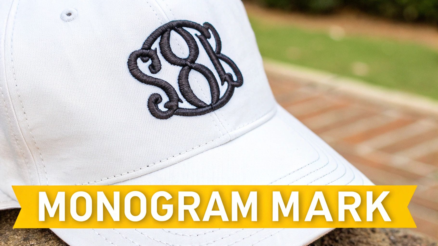
This style is deeply woven into the fabric of hockey. The St. Louis Blues' "SL" shoulder patch is iconic, and the Calgary Flames' flaming "C" is one of the best in the league. The Montreal Canadiens' "CH" is the grandfather of them all. These monograms are so effective because they are simple, memorable, and infinitely scalable, working just as well on a cap as they do at centre ice. They represent history, location, and identity in one elegant package.
Actionable Insights for NHLdle Players
- Know the Initials: This is your bread and butter. "CGY" for Calgary, "LAK" for Los Angeles. It's a fundamental part of the game.
- Watch for Throwbacks: Teams often use old monograms on their third jerseys. Recognizing the old Vancouver Canucks "VC" logo can help you place a player in a specific game or season.
- Think Beyond the Primary: Some teams have monogram shoulder patches that are different from their main logo. Knowing these secondary logos gives you another layer of expertise.
6. Animal Head/Face Logos
Few things communicate raw power and instinct like an animal's face. Animal head logos go beyond simple mascot imagery, focusing on a detailed, often ferocious, representation of an animal's head or face. This style is incredibly effective at conveying strength, aggression, and speed. It’s a direct and visceral approach that creates an intimidating and memorable brand.
Some of the most iconic sport team logos leverage this powerful visual. The Detroit Red Wings' winged wheel is a classic, but the true animal heads belong to teams like the Florida Panthers and the Nashville Predators. The Arizona Coyotes' kachina-inspired howling coyote head is a masterclass in regional character. These designs prove that a well-executed animal face can become a symbol of a team's spirit and competitive nature.
Actionable Insights for NHLdle Players
- Pay Attention to Detail: Is the San Jose shark breaking a stick? Does the Canucks' orca have the Haida-inspired details? These elements are unique to each team.
- Know the Rebrands: The Buffalo Sabres have had several versions of their buffalo head logo. Knowing the difference between the red-eyed "angry goat" and the current, more classic version can pinpoint a player's tenure.
- Connect to Player Style: It's fun to associate a gritty player like Matthew Tkachuk with the fierce Panthers logo or a predator on the ice like Filip Forsberg with the Predators' crest.
7. Colour-Based Identity Logos
Sometimes, the most dominant feature of a logo isn't a symbol or a word, but its colour. Colour-based identity logos rely on a powerful, distinctive palette to do the heavy lifting, creating an immediate connection to the team. This approach uses bold, unique colour combinations to build a brand that is recognizable even without text or imagery.
This strategy is behind some of the most memorable sport team logos. Think of the iconic "Bleu, Blanc et Rouge" of the Montreal Canadiens or the silver and black of the Los Angeles Kings. The Philadelphia Flyers' unmistakable orange and black is another perfect example. These powerful colour schemes are so effective that they become a core part of a team's legacy and are fiercely defended by their fanbases.
Actionable Insights for NHLdle Players
- Master the Palettes: Knowing that the Wild use Forest Green and Iron Range Red can separate them from the Devils' red and black. It's about the specific shades.
- Think Third Jerseys: A team's alternate jersey colour scheme can be a tricky clue. Recognizing the Coyotes' "Kachina" colours or the Ducks' original eggplant and jade is an expert move.
- Colour Changes Signal Eras: The Canucks' switch from blue and green to the "flying skate's" black, red, and yellow marks the Pavel Bure era. The Kings' move from purple and gold to silver and black signals the Gretzky trade.
8. Historical/Retro Logos
Everything old is new again, and that couldn't be more true in hockey. Historical or retro logos tap into a powerful sense of nostalgia, reviving classic designs from a team's past. This approach isn't just about looking backward; it’s about connecting generations of fans and honouring a franchise's heritage. It's a celly for the ages that fans absolutely love.
Some of the most celebrated sport team logos are throwbacks. The Hartford Whalers' beloved green and blue logo is a prime example, as is the Quebec Nordiques' iconic igloo design. Teams like the Leafs often return to more traditional leaf designs from their storied past. These logos feel both timeless and fresh, proving that great design never truly goes out of style. You can test your knowledge of these classic crests with a challenging NHL logo quiz.
Actionable Insights for NHLdle Players
- Know Your Defunct Teams: A huge advantage in trivia is knowing logos for teams that relocated, like the Atlanta Thrashers or Colorado Rockies.
- Connect the Logo to the Legends: When you see the "flying skate," you should think of Bure and Linden. The Whalers logo brings up Ron Francis and Kevin Dineen.
- Recognize "Reverse Retro" Designs: The NHL's recent Reverse Retro program has brought back tons of old logos with new colour twists. Knowing these modern variations is a next-level skill.
9. Sport-Specific Symbol Logos
There's no mistaking what game is being played when the logo itself features the tools of the trade. Sport-specific symbol logos embed iconic equipment directly into their design. This powerful technique uses hockey sticks, pucks, or skates not just as decoration, but as a core component of the brand’s identity. It’s a direct and effective way to communicate a team's purpose.
This approach is woven into the fabric of hockey history. The original Columbus Blue Jackets logo cleverly placed a hockey stick within the Ohio state flag design. The Minnesota Wild’s clever crest uses a hockey stick to form the mouth of its animal. The most famous example is the classic Vancouver Canucks "stick-in-rink" logo. These emblems leave no doubt about the team's arena of competition.
Actionable Insights for NHLdle Players
- Spot the Stick (or Puck): This is a key identifier. Teams like the Blue Jackets, Wild, and Canucks have made it a central part of their identity at some point.
- Look for Subtle Integrations: The Carolina Hurricanes' secondary logo is a flag with a hockey stick. The old Atlanta Thrashers logo had a stick in it. Finding these is a pro move.
- Relate It to Team Name: A team named the "Jets" doesn't need a hockey stick in its logo, but for a team named the "Wild," it helps ground the abstract concept in the sport itself.
10. Text + Icon Combination Logos
Why choose between a wordmark and a symbol when you can have the best of both worlds? Text and icon combination logos are the ultimate power play in branding, pairing a distinct typographic element with a memorable icon. This hybrid approach creates a versatile and complete brand identity that communicates both the team’s name and its unique character. It’s a modern strategy that gives a franchise two powerful tools to work with.
This dual-threat approach is all over the NHL. The Boston Bruins' "Spoked B" is a perfect marriage of a letterform and an iconic shape. The Tampa Bay Lightning's logo features the team name alongside a powerful lightning bolt. These brilliant sport team logos demonstrate how text and an icon can work in perfect harmony, creating a brand package that is greater than the sum of its parts.
Actionable Insights for NHLdle Players
- Break Down the Components: When you see the Oilers logo, you see the word "Oilers" and the oil drop. Recognizing both parts helps confirm your guess.
- Know Which Part is Primary: Do fans call them the "Bolts" (icon) or "Tampa Bay" (text)? Knowing the common nickname can help your memory recall.
- Identify Standalone Icons: Many teams use just the icon from their combo logo on their helmets or shoulder patches. Recognizing the Leafs' leaf or the Flames' "C" without the text is crucial. You can even apply these design principles to smaller items, like creating a design for a custom hockey puck.
10 Sports Team Logo Styles Comparison
| Logo Type | Implementation Complexity 🔄 | Resource Requirements ⚡ | Expected Outcomes ⭐📊 | Ideal Use Cases 💡 | Key Advantages ⭐ |
|---|---|---|---|---|---|
| Wordmark / Logotype Logos | Low — typography-focused, few elements | Low — custom type, minimal production | Clear name recognition; moderate distinctiveness — ⭐⭐⭐ | Teams prioritizing name clarity, merchandise | Versatile, easy reproduction, clear messaging |
| Mascot / Character-Based Logos | High — detailed illustration, multiple poses | High — illustrator, style guides, variants | High engagement and emotional connection — ⭐⭐⭐⭐ | Family-friendly teams, live mascots, fan events | Memorable, personality-rich, merchandising depth |
| Shield / Crest Logos | High — layered heraldic composition | Medium–High — skilled designer, simplified versions | Conveys heritage and authority — ⭐⭐⭐⭐ | Traditional clubs, heritage-oriented brands | Timeless, storytelling, formal sophistication |
| Geometric / Abstract Logos | Medium — concept-driven minimal forms | Low–Medium — strong concept and grid work | Modern, scalable identity; high clarity — ⭐⭐⭐ | Contemporary franchises, digital-first teams | Scalable, timeless, highly versatile |
| Interlocking Letters / Monogram Logos | Medium — precise typographic construction | Low–Medium — custom lettering and testing | Instant recognition on apparel and caps — ⭐⭐⭐⭐ | Merch-heavy brands, legacy teams | Highly recognizable, compact and classic |
| Animal Head / Face Logos | High — realistic/stylized illustration detail | High — illustrator, simplified/systematic versions | Strong visual impact and team persona — ⭐⭐⭐⭐ | Teams emphasizing strength or ferocity | Distinctive, emotive, strong fan affiliation |
| Color-Based Identity Logos | Low — color-driven design, minimal graphics | Low — palette specification and QA | Strong color recall; flexible identity — ⭐⭐⭐ | Teams with unique color heritage, simple marks | Extremely versatile, easy to reproduce |
| Historical / Retro Logos | Medium — research + tasteful revival | Medium — historical research, refinement | High nostalgia and collector appeal — ⭐⭐⭐⭐ | Legacy franchises, anniversary/retro lines | Emotional connection, authenticity, differentiation |
| Sport-Specific Symbol Logos | Medium — integrate equipment stylizedly | Medium — icon design, scalability testing | Immediate sport recognition; clear messaging — ⭐⭐⭐ | New teams needing instant sport clarity | Direct symbolism, recognizability across contexts |
| Text + Icon Combination Logos | Medium–High — balance and multiple configurations | Medium — dual-mark systems, usage guidelines | Comprehensive brand system; flexible applications — ⭐⭐⭐⭐ | Full-brand systems, multi-platform needs | Versatile, icon-only option, strong storytelling |
Lace 'Em Up: Put Your New Logo Knowledge to the Test
Alright, you've done the pre-game skate and you’re ready to hit the ice. We've dropped the puck on everything from classic wordmarks to aggressive animal-head designs, breaking down the visual language that defines our favourite teams. This journey through the world of sport team logos wasn't just a design lesson; it was a masterclass in hockey history. You now have the playbook to deconstruct any emblem that comes your way.
Think about the distinct power of a well-designed shield logo, projecting heritage, versus the sleek feel of an abstract design. You can now spot the difference between a simple monogram, like the one used by the Canadiens, and a detailed mascot logo that brings a team's personality to life. This knowledge is your new secret weapon. It transforms a simple logo from a piece of gear into a vital clue.
Turning Logo Literacy into Winning Streaks
So, how do you translate this fresh knowledge into a top-shelf snipe in your next hockey guessing game? It's all about connecting the dots. When you’re faced with a tough NHLdle puzzle and the logo is your only clue, your new skills come into play.
- Era Identification: Does the logo have a retro feel? That can help you narrow down players from a specific decade, like the era of the Hartford Whalers or the original Vancouver Canucks stick-in-rink design.
- Geographic Clues: A logo incorporating local symbols can be a dead giveaway. The old Nordiques logo is pure Quebec, while the current Jets logo has the RCAF roundel.
- Rebrand Timelines: Remembering a team's logo history is a game-changer. If you see the Buffalo Sabres' infamous "Buffaslug" logo, you know the player had to be on the roster between 2006 and 2010. Think Daniel Brière or Chris Drury.
This deeper understanding of sport team logos gives you a strategic edge. You’re no longer just guessing; you’re making educated deductions based on design principles and team history. For those who feel inspired by this deep dive, you can even explore how to make a cool sports logo and apply these principles to your own creative projects or fantasy teams.
Ultimately, these logos are more than just symbols; they are the heartbeats of their franchises. They represent entire cities, generations of fans, and countless unforgettable moments on the ice. They are the crest on the jersey players proudly tap after a big goal. Now, you don't just see a logo; you see the whole story. It's time to put that insight to the test.
Ready to drop the gloves and test your new skills? Head over to SportsDle and see how your advanced logo knowledge can help you conquer our daily NHL puzzles. From guessing mystery players to identifying teams, SportsDle is the ultimate arena to prove you’re a true hockey mastermind.